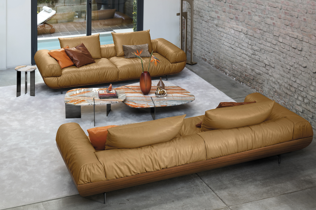
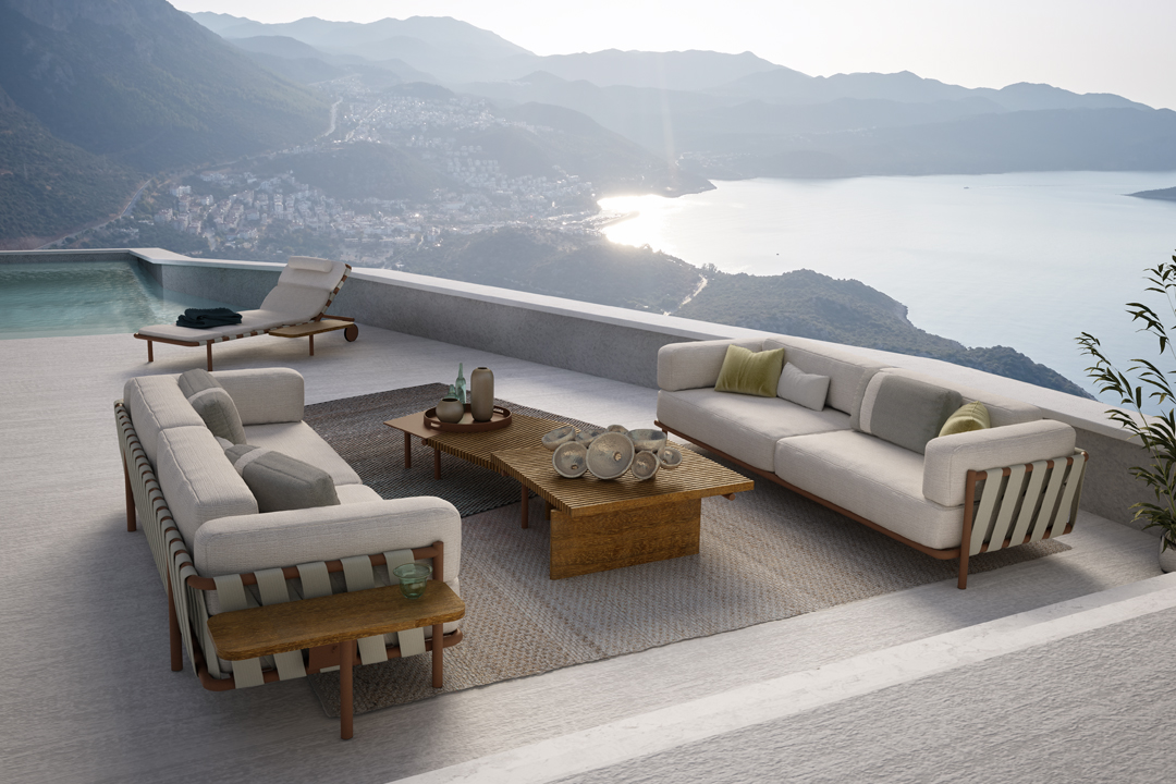
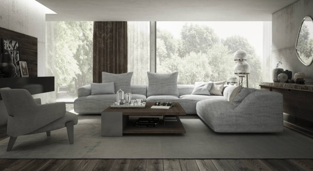
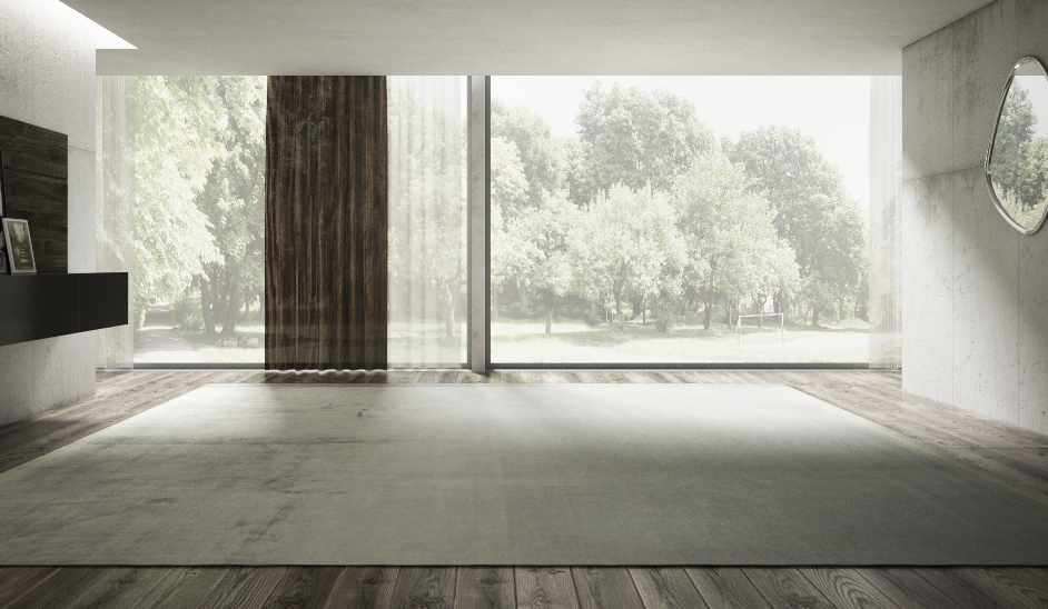
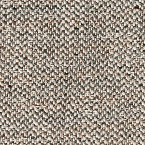
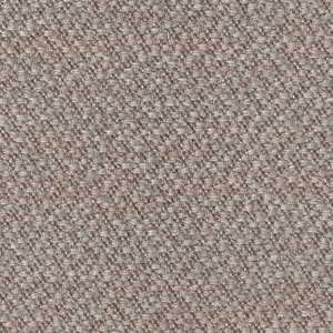
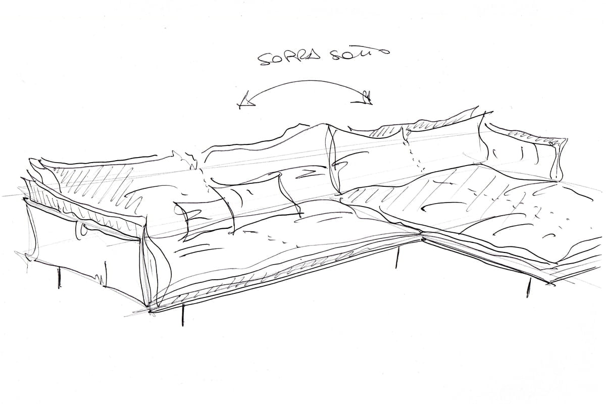
Lavoro, relax, quotidianità. Il divano è passato da semplice complemento d’arredo per il salotto a qualcosa di più importante nella vita di tutti i giorni. È affermazione di sé. È dove il design trova una casa e uno scopo. Nella nostra collezione il design è strettamente intrecciato al comfort in ogni creazione. Realizziamo divani rigorosamente Made in Italy che resistano alla prova del tempo.

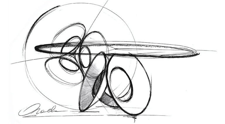
Che sia per una cena tra amici o per divertimento il tavolo da pranzo è sempre sinonimo di condivisione. Ogni tavolo Arketipo è un mix di design e ingegneria, combinati con sapiente equilibrio per ottenere tavoli unici.
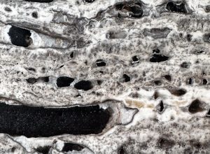
I materiali sono selezionati e abbinati per esaltare le peculiarità di ogni pezzo. Audaci e leggeri, sontuosi e minimal, ognuno contraddistinto dal tocco abile dello stile Arketipo.
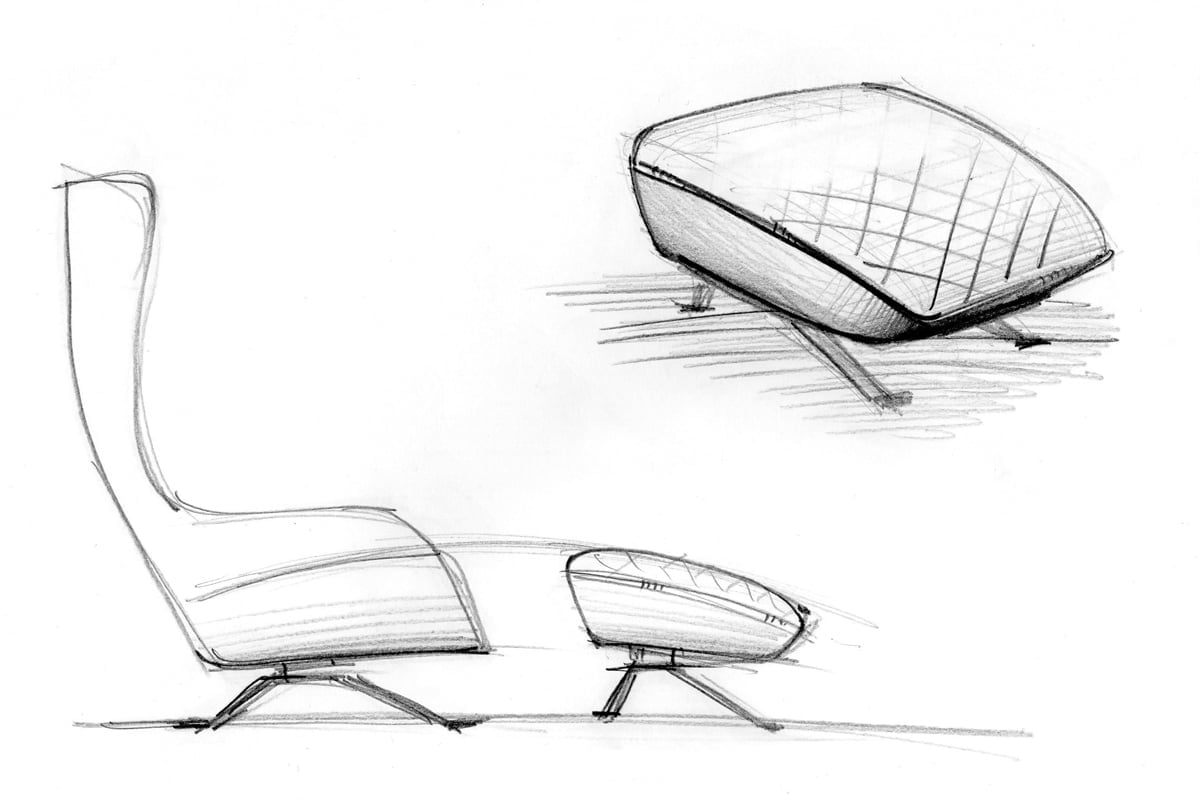
L’iconologia è alla base del design delle nostre poltrone. Ci siamo allontanati dal banale, dalle proposte monotone e scontate chiedendo ai nostri designer progetti esclusivi che riflettano la nostra attenzione ai dettagli. Poltrone dal design che cattura, adatto ad ogni spazio, ma soprattutto design con scopo e funzione.